- Case Studies
-

-
Leading Insurance Company


Accessibility and readability challenges across various age groups.
Misplacement and labeling/
language concerns regarding CTAs.
Navigation and beneficiary
User flows complexities.
Scanability issues impacting
user experience.
Scalability Challenges.
usability and spacing concerns.
Inconsistent design among different user logins for customer-facing
and client-facing.
Responsiveness issues affecting device adaptability.


Perform a UX audit to
evaluate the effectiveness of
both Customer Facing and
Client Facing applications.
Conduct user interviews to
identify pain points and offer
tailored solutions to
address
their needs.
Ensuring that content remains
readable and accessible on
devices ranging from
smartphones to desktop
computers.
Adhere to best practices during
implementation to ensure the
application is
adaptable to
various screen sizes and
remains responsive.
Implement a Design System
to maintain design
consistency across the
entire
application.
Offer actionable
recommendations aimed at
improving the overall user
experience.
Prioritize user accessibility, readability, and usability enhancements.


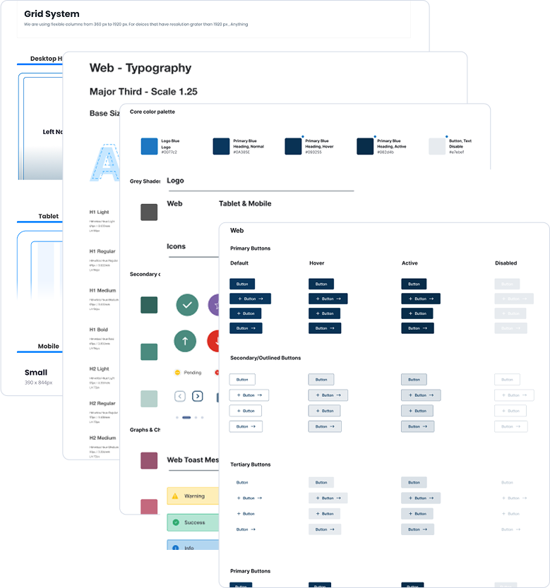
A design system is the foundation of a product’s UI and interaction design. It includes standardized components, patterns, and guidelines that ensure consistency, efficiency, and a seamless user experience.
Clearly defined principles that guide the overall design philosophy, ensuring consistency and a shared vision.
Standardized UI components and design patterns that are consistently applied across the product.
Specifications for typography styles, font choices, and color palettes to maintain a cohesive visual identity.
Consistent use of icons and imagery that align with the overall design language and reinforce brand identity.
Guidelines for creating responsive layouts that adapt to different screen sizes and maintain consistency across devices.
Inclusion of accessibility guidelines to ensure that the product is usable by a diverse audience, including those with disabilities.
Comprehensive documentation that provides guidance on how to use each component, pattern, and guideline, facilitating easy adoption by design and development teams.
Standards for animations, transitions, and interactive elements to create a seamless and intuitive user experience.
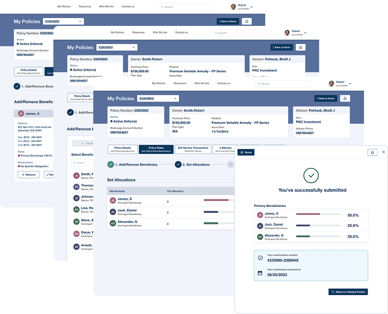
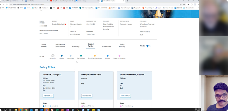
I've introduced a step-by-step wizard component for adding beneficiaries, providing users with a clear understanding of the process through easily navigable steps.
Users can conveniently designate both existing and new users as beneficiaries, facilitated by an intuitive layout that allows seamless selection of existing users and effortless addition of new ones.
Implemented color-coded circles accompanied by highlighted text displaying names for swift and easy readability. Additionally, these color percentage bars appear at the end of the flow, enabling users to allocate percentages efficiently.
Displayed newly added beneficiaries in a popup for quick reference and easy access to the updated list.

Clearly understanding the problem statement and the requirements.
Engaging with key stakeholders, including clients, team members,
and end-users. Collect
their input
and insights to ensure a
comprehensive understanding
of
expectations through app demos.
Identify high-level usability accessibility problems
6 App demos from clients and
team members.
13 Stakeholder and user interviews to identify their pain points.
Insight from communications team.
Creating the wireframes and
user flows.

Creating the unified
Design System.
Creating a moodboard
ideations.
Creating visual mockups for the complex user flows.
Creating the Design Iterations.
Creating final design with Reusable Components with Annotations, UI Kit, Visual Mockups, & User flows
Final design handoff with Clients.
Educating the usage of Figma tool with the developers.
Capture user pain points from Internal and external stakeholder interviews.
Understand the critical usability and
identify learning outcome goals.
Identifying the patterns from the
user interviews.
Understand high-level application
landscape.
Deep dive session on user flows,
application functionality.
Identify user problems and
usability issues.
Summarizing and compiling
research findings.
Get a sense of the application and the best solutions for the user pain points.
Identifying the user patterns.
(Heuristic Evaluation) Apply
experience audit best practice.
Capture usability problems and what's working.
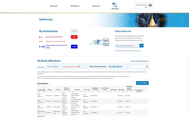
I need to go to middle of the page to view the tabs & accordion.
Print view has lot of space.
Inaccurate interest to out of surrender policies.
Font sizes should be more.
Accessibility Issue.
Three clicks to view the details.
Partial withdrawal details: save button is not highlighting for owner in withdraw form.
Lot of misplacements of buttons and not suitable labels while adding Beneficiary.
Related Parties should be changed to another name as it is not relevant.
Need to add international address while adding beneficiary (less priority)
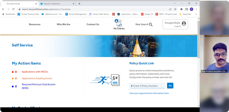
Related Parties tab not indicating proper usage (probably have to change the wordings)
Filter never used.
Accessibility issues, Tabs are not highlighting.
Navigation accessibility issues.
Statement tab should have filter option to view the relevant statement like address, beneficiary & 1099
Accordions are occupying space and unable to scan the content easily.
Fonts sizes are not accessible for the aged group above 65Yrs.


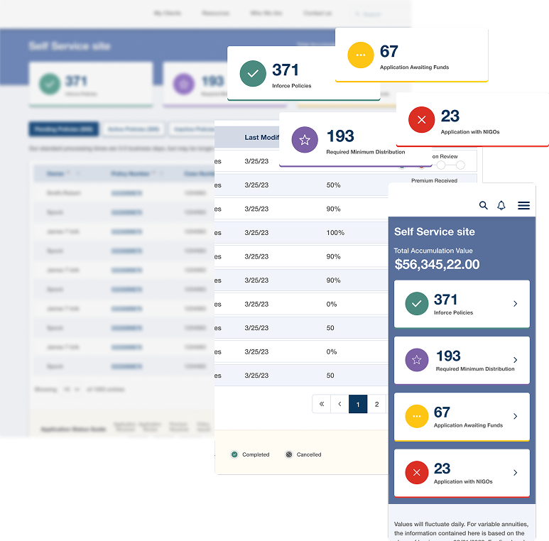
Identified UX challenges span diverse user demographics and experiences. These encompass accessibility, navigation, CTA placement, language labeling, flow issues, content scanning, scalability, design consistency, usability, spacing, and responsiveness. Addressing these comprehensively is essential for improved user satisfaction and application usability.

Elevate accessibility by enhancing features like font size, color contrast, and overall design to cater to users with diverse needs, ensuring readability, scan ability, and improved accessibility, especially for elderly clients.
User feedback highlights the need for clear, easily accessible navigation. By placing key navigation elements, streamlining menus, and using intuitive design, we aim to provide users with a seamless experience on our platform.
A unified design system serves as a foundation for efficient collaboration, consistency, scalability, and improved user experiences in product design.
Ensuring the responsiveness of our design is crucial, as it supports a wide array of devices and screen sizes, accommodating users with diverse needs.
User feedback highlights the importance of clear, easily accessible navigation. By placing key elements, streamlining menus, and using intuitive design, we aim to provide users with a seamless experience.
User feedback underscores the need to improve login processes. By prioritizing user-centric design, streamlining authentication, and optimizing system responsiveness, we can create a more intuitive and seamless experience.
Improve the usability of the beneficiary account section by simplifying the interface and incorporating user-friendly design elements.

Quickly retrieve relevant information, facilitating a streamlined decision-
making
process.
Improve user satisfaction by providing
a positive overall experience within the
system.
Foster increased user engagement, creating a more dynamic and interactive user experience.
A positive overall experience contributes
to heightened user satisfaction and
engagement.
Higher user engagement often correlates with increased conversion rates.
Elevated engagement opens up more opportunities for revenue generation
within the
platform.
Easily create a beneficiary user flow
with our intuitive wizard steps for a
straightforward process.
Design tailored for different age groups, offering a smooth and intuitive journey for all users.
Enjoy user-friendly interfaces that reduce the learning curve, enabling effortless interaction and navigation.
Benefit from a consistent, responsive design across all devices and screen sizes, enhancing accessibility and flexibility.
Enhance user connection with a
consistent design system, AA
compliance, and
focused usability and accessibility solutions.
Ensure designs are easily accessible and readable, contributing to a seamless and inclusive experience for all users.