- Case Studies
-

-
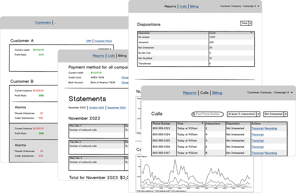
Call Center Automation System


An automated call center system that logs customer numbers, auto-dials them, and routes active
calls to staff. Missed calls are detected and redirected to the right team member on callback.
An Automated Call Center System that logs customer phone numbers and initiates calls automatically.
When a potential customer is detected, the call is transferred to an internal staff member. If customers miss the initial
call and call back later, the system detects these callbacks and forwards them to the appropriate staff member.
| Role | Access Scope | Dashboard View | User Management | Campaign Requirements |
|---|---|---|---|---|
| Super Admin | Full visibility across all companies, accounts, and campaigns | Access to a global dashboard with overall dispositions | Can create and manage Company users Client users | Can select and customize data visualizations (graphs) |
| Account Manager | Manages assigned accounts and their campaigns | Dashboard limited to managed accounts | Can create and manage client users | Supports multiple accounts per manager |
| Client | Access restricted to their own account and campaign data | Campaign overview | Can create and manage campaigns | Reports Overview Call History |
Essentially to identify and
articulate the core issues of the
product.
Increase customer satisfaction by providing a seamless and intuitive user experience.
Design branding and consistent design system.
Responsiveness for device
adaptability.
Navigation and user flow
complexities.
Ensure the usability and AA compliance standards.
Scanability impacting user experience.
Scalability hurdles.
Meet accessibility standards and inclusivity designs as best-practices.
Develop personas and user journey maps to ensure the design meets the needs and behaviours of the target audience.
Ensure the application is accessible to people with disabilities by following WCAG guidelines.
Ensure the application works well on all devices, including desktops, tablets, and mobile
phones.
Offer actionable recommendations aimed at improving the overall user experience.
Implement a Design System to maintain design consistency across the application.
Implement clear, intuitive navigation structures and reduce complexity.
Prioritize user accessibility, readability, and usability enhancements.
Visually lay out interface structure and key interactions before diving into high-fidelity design.
Low-Fidelity Wireframes: Basic black-and-white layouts showing structure, not visuals.
Focus: Layout, hierarchy, user flow


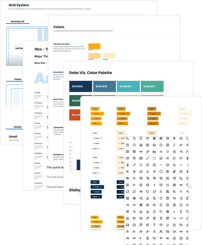
A design system is the foundation of a product’s UI and interaction design. It includes standardized components, patterns, and guidelines that ensure consistency, efficiency, and a seamless user experience.
Clearly defined principles that guide the overall design philosophy, ensuring consistency and a shared vision.
Standardized UI components and design patterns that are consistently applied across the product.
Specifications for typography styles, font choices, and color palettes to maintain a cohesive visual identity.
Consistent use of icons and imagery that align with the overall design language and reinforce brand identity.
Guidelines for creating responsive layouts that adapt to different screen sizes and maintain consistency across devices.
Inclusion of accessibility guidelines to ensure that the product is usable by a diverse audience, including those with disabilities.
Comprehensive documentation that provides guidance on how to use each component, pattern, and guideline, facilitating easy adoption by design and development teams.
Standards for animations, transitions, and interactive elements to create a seamless and intuitive user experience.

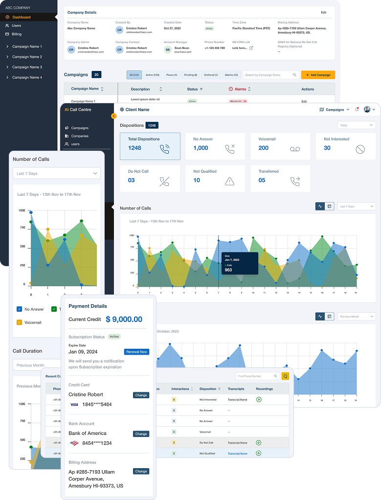
Redesigned cards with color-coded statuses for quick visual parsing.
Hover interactions to reveal deeper metrics without clutter.
Responsive layout for better visibility across devices.
Actionable insights embedded directly within each card
Sticky sidebar with contextual links for smooth section switching.
Breadcrumbs and smart back-navigation to preserve user flow.
Consistent UI elements and minimized clicks for key tasks.
Improved focus states for accessibility and keyboard navigation.
Interactive charts with filter options (e.g., time ranges, statuses).
Tooltips on hover for precise data
insight.
Dynamic loading for large datasets, ensuring fast performance.
Graph styles align with brand language for visual consistency.
Clear separation between company profile, contacts, and settings.
Editable fields with inline validation for faster updates.
Tag-based system for segmenting companies by industry, size, or location.
Collapsible sections for clean overview of campaign metrics.
Status indicators for active, paused, and completed campaigns.
Drill-down capability to see disposition breakdowns per campaign.
Integrated performance highlights and quick action buttons.
Clean, secure UI for managing cards and billing info.
Card icons (Visa, MasterCard, etc.) for easy recognition.
Activity logs to track recent payments or changes.
Support for adding multiple payment methods with priority ranking.


Exploring and leveraging emerging technologies to utilize the latest advancements and engage stakeholders with best practices in usability.
Identify and validate the problem the product aims to solve through user feedback.
Conduct UX research, including user journey mapping, to gain deep insights into user behaviors and preferences.
Emphasizing the problem's urgency and importance.
Addressing critical issues such as accessibility, navigation, workflow optimization, content scanning, scalability, design consistency, usability, spacing, and responsiveness.
The identified UX challenges span a diverse array of user demographics and experiences.
Effectively resolving these challenges is vital for significantly enhancing user satisfaction and overall application usability.


Elevate accessibility by enhancing features like font size, color contrast, and overall design to cater to users with diverse needs, ensuring readability, scan ability, and improved accessibility, especially for elderly clients.
User feedback highlights the need for clear, easily accessible navigation. By placing key navigation elements, streamlining menus, and using intuitive design, we aim to provide users with a seamless experience on our platform.
A unified design system serves as a foundation for efficient collaboration, consistency, scalability, and improved user experiences in product design.
User feedback highlights the importance of clear, easily accessible navigation. By placing key elements, streamlining menus, and using intuitive design, we aim to provide users with a seamless experience.
User feedback underscores the need to improve login processes. By prioritizing user-centric design, streamlining authentication, and optimizing system responsiveness, we can create a more intuitive and seamless login experience.
Ensuring the responsiveness of our design is crucial, as it supports a wide array of devices and screen sizes, accommodating users with diverse needs.
A positive overall experience contributes to heightened user satisfaction and engagement.
Quickly retrieve relevant information, facilitating a streamlined decision-making process.
Improve user satisfaction by providing a positive overall experience within the system.
Foster increased user engagement, creating a more dynamic and interactive user experience.
Elevated engagement opens up more opportunities for revenue generation within the platform.
Higher user engagement often correlates with increased conversion rates.
Enjoy user-friendly interfaces that reduce the learning curve, enabling effortless interaction and navigation.
Design tailored for different age groups, offering a smooth and intuitive journey for all users.
Enhance user connection with consistent design system, AA compliance, usability and accessibility solutions.
Benefit from a consistent, responsive design across all devices and screen sizes, enhancing accessibility and flexibility.
Consistent UI elements and minimized clicks for key tasks.
Ensure designs are easily accessible and readable, contributing to a seamless and inclusive experience for all users.